Pill Pal SimplifiesEvery Daily Dose.
An accessibility-first companion that helps people take the right medicine at the right time.
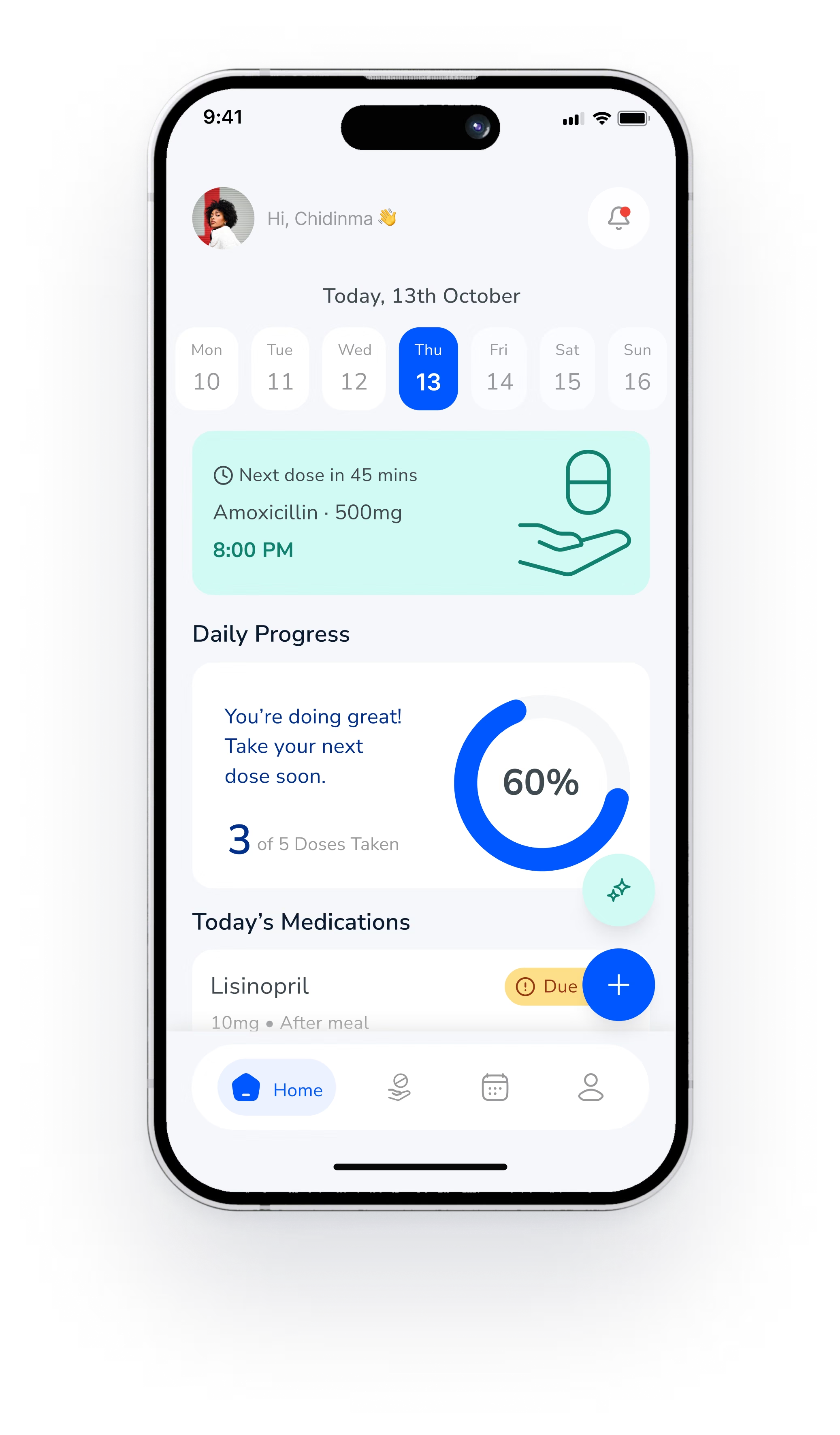
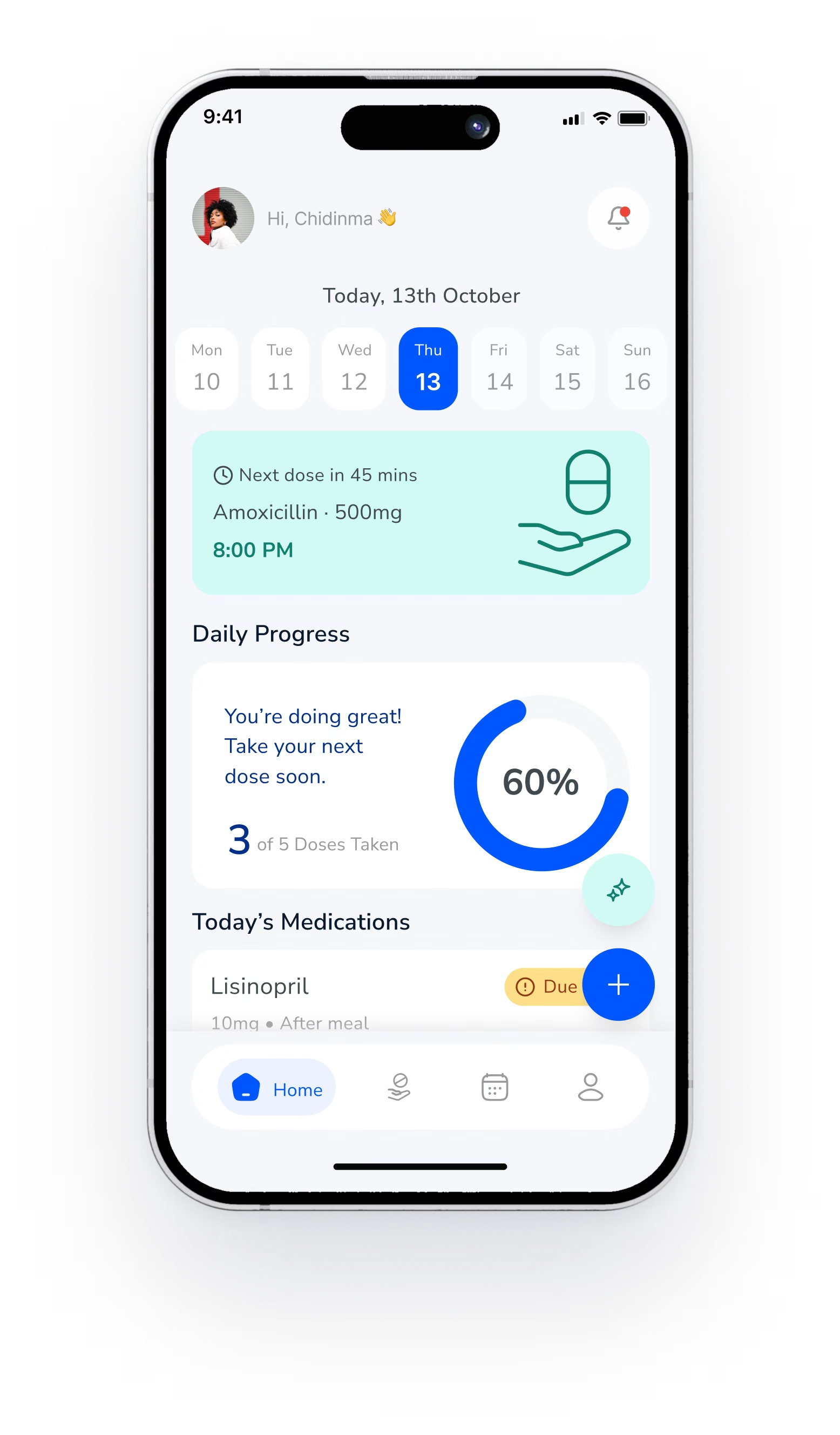
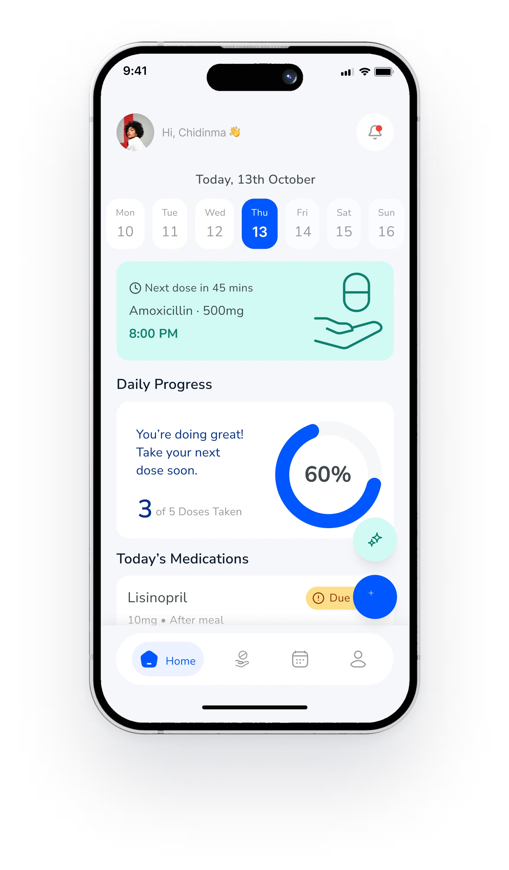
Next dose in 45 mins
Amoxicillin · 8:00 PM
Daily progress
3 of 5 doses taken
Researched
A holistic approach to medication care
Explored
How Pill Pal makes every dose easier
Unpacking the
entire Pill Pal project
Turning Missed DosesInto Daily Confidence.
These gaps lead to medication errors, health complications and stress for patients and the people who care for them.
Doses slip from memory
Cognitive decline and busy schedules make it easy to forget a dose, or forget one was taken.
Apps that are hard to use
Small text, cluttered screens and alerts that vanish shut out the people who need help most.
Caregivers left out
Family and providers cannot see whether a dose was taken, so they find out too late.
Errors with real costs
Missed or doubled doses lead to complications and daily worry for patients and families.
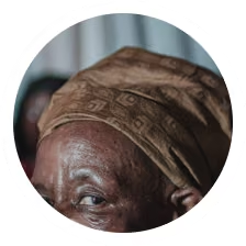
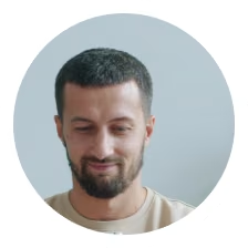
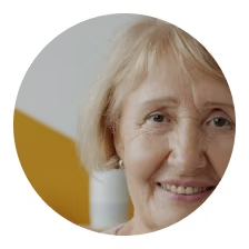
One adaptive, inclusive app
Personal reminders
Shaped by each person’s routine and health condition.
Accessible by default
Large fonts, pill photos, audio prompts and haptic feedback.
Shared care
Caregivers and providers can follow adherence securely, in real time.
One Flow forEvery Dose.
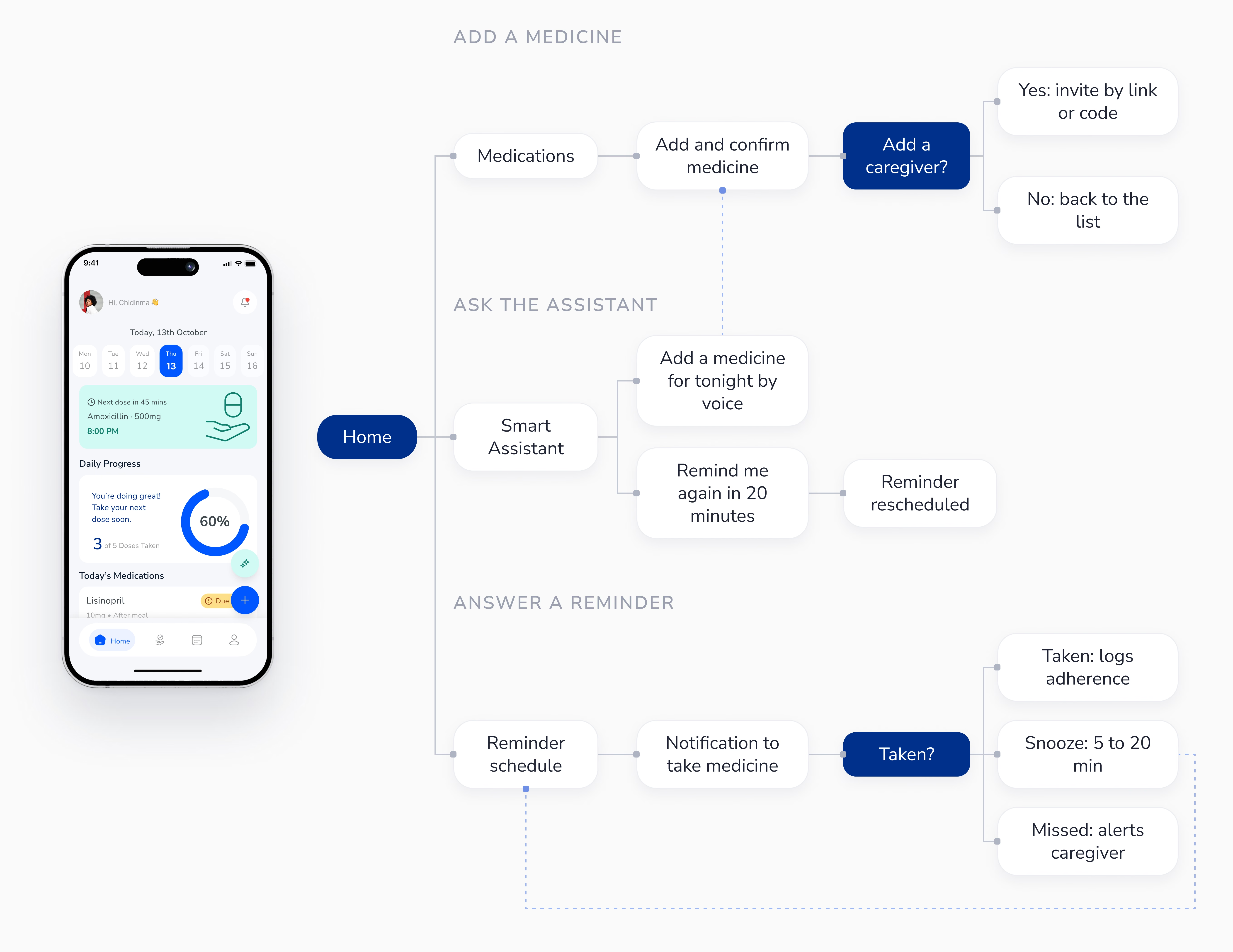
Three paths start from Home: adding a medicine, asking the assistant, and answering a reminder. Every path ends in a clear record.
Reminders ThatWait for You.
84% of the people we surveyed missed doses because reminders vanished too fast, were too quiet, or were easy to dismiss.
The problem
A reminder that disappears in a few seconds does not help someone who is outside, distracted or hard of hearing. Alerts alone were not enough.
A standard notification
Simple to build, but it fades in seconds and one swipe dismisses it.
A reminder that waits
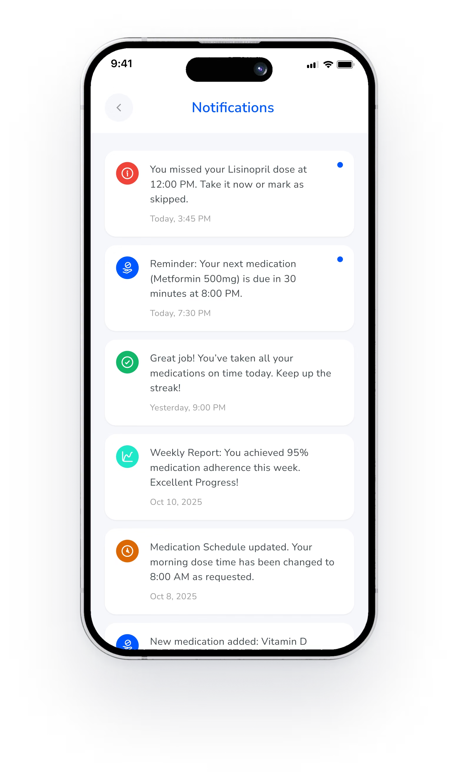
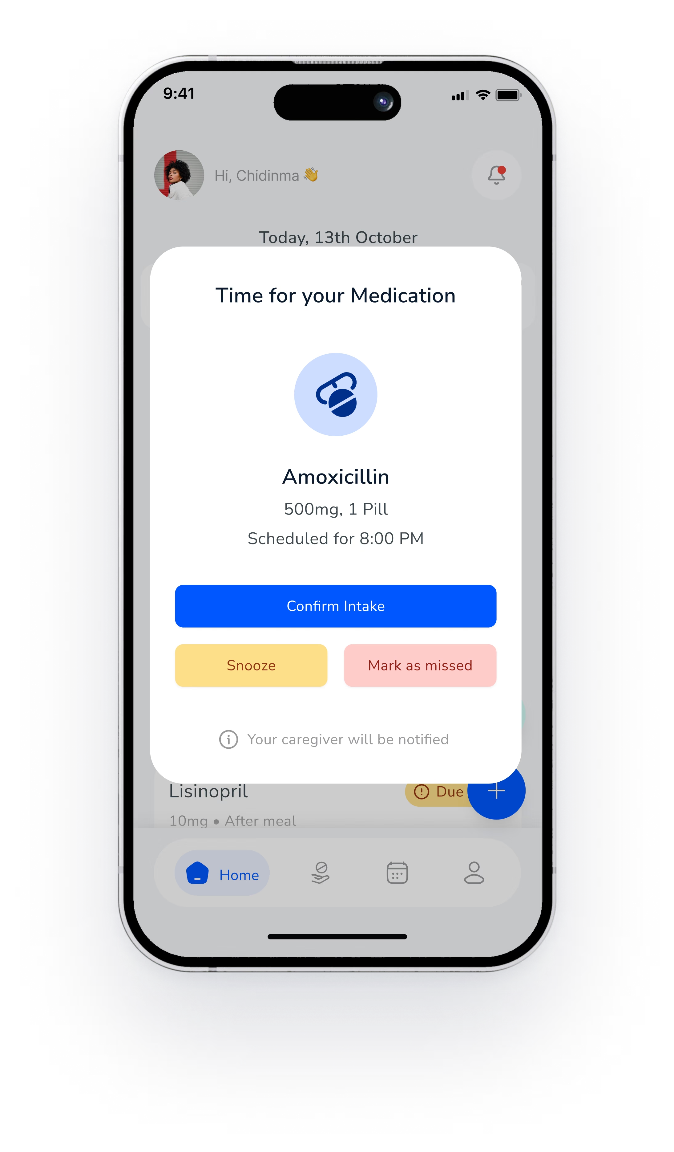
Stays on screen until someone confirms, snoozes or marks the dose as missed.
The trade-off
A reminder that waits can feel pushy to busy people like Daniel. Snooze moves it 5 to 20 minutes later instead of dismissing it, and logs the delay.
Why it was right
It answers both needs at once: the alert cannot slip by unseen, and every dose ends as Taken, Snoozed or Missed, with a time stamp. When a dose is missed, the caregiver is told.
From wireframe to final
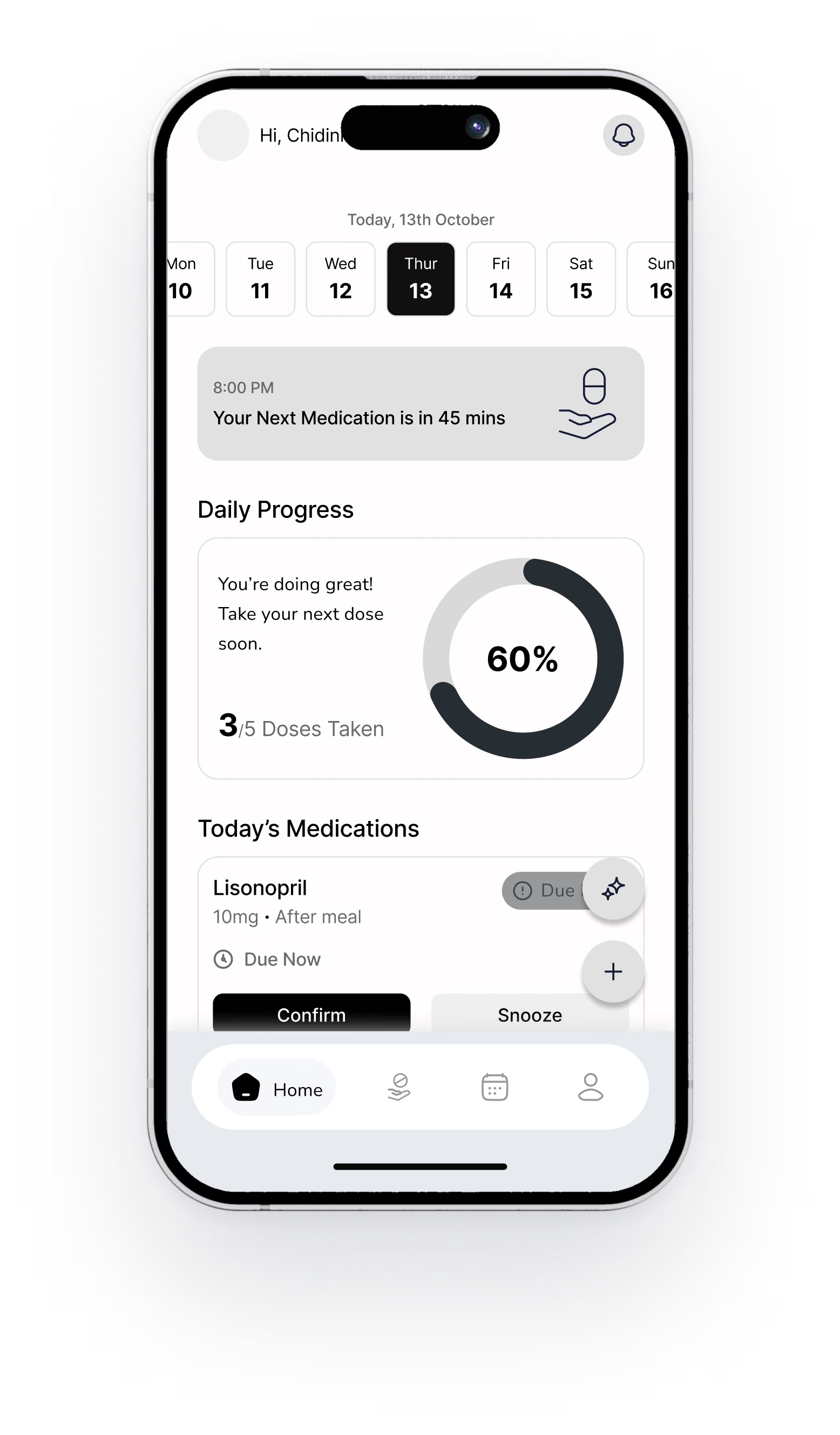
The wireframe put Confirm and Snooze inside the medication list, where they were easy to miss. The final design moves them into a reminder that waits for an answer.
One App,Every Ability.
87% struggled with complicated screens, whatever their age, health or comfort with technology.
The problem
Simplicity was not a senior feature. People of every age wanted clear, calm screens that need little thought.
A separate senior version
Easy to scope, but it splits the product and labels people by age.
Settings inside one app
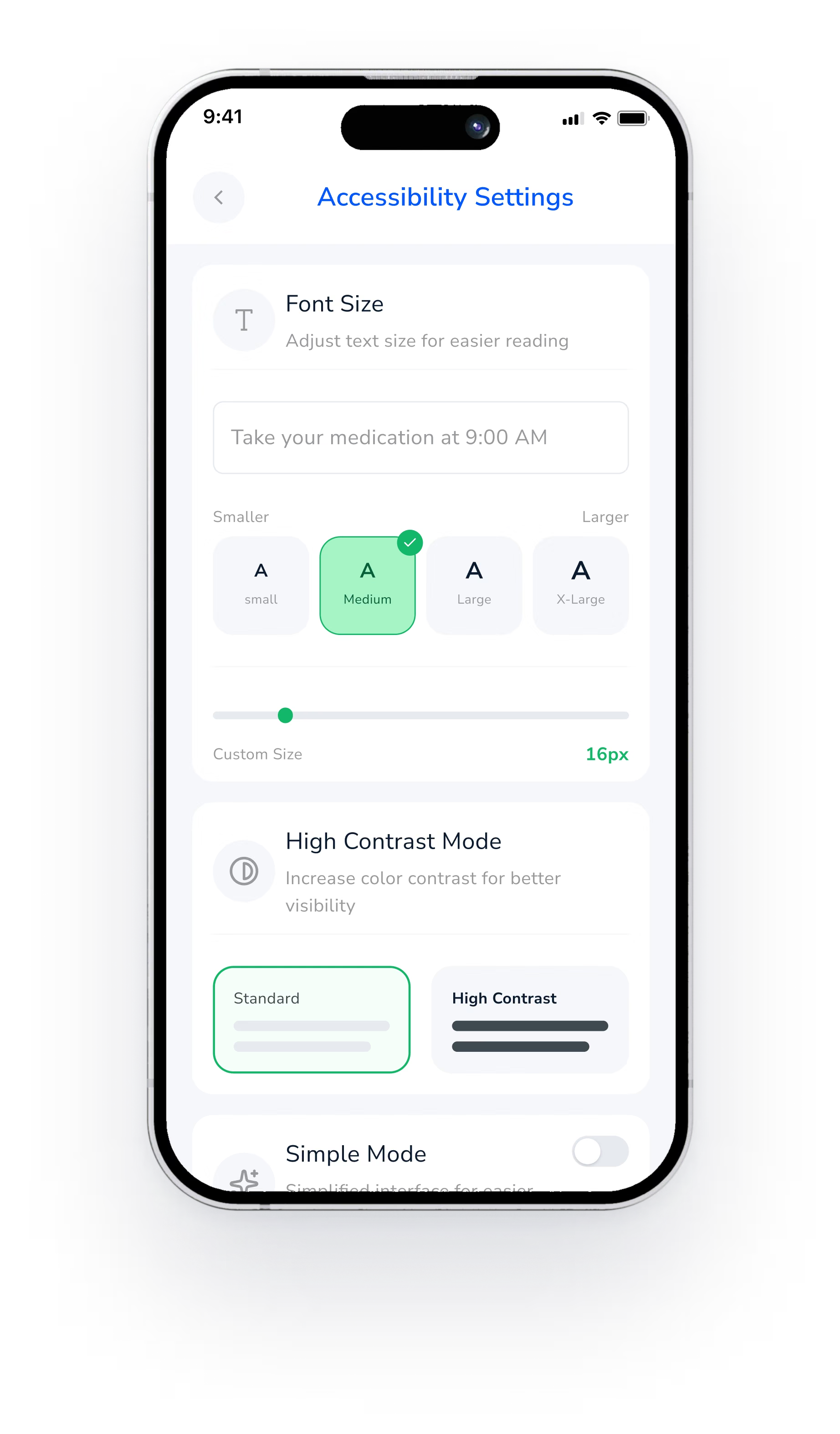
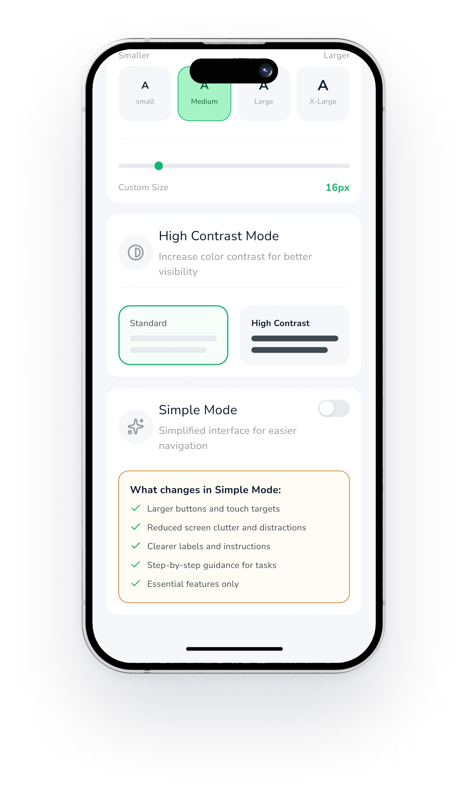
Text size, high contrast and Simple Mode, all in one place.
The trade-off
More settings to design and test. Every option had to work on every screen, not just a few.
Why it was right
Everyone gets the same app and the same updates. People choose what they need, and nobody is singled out.
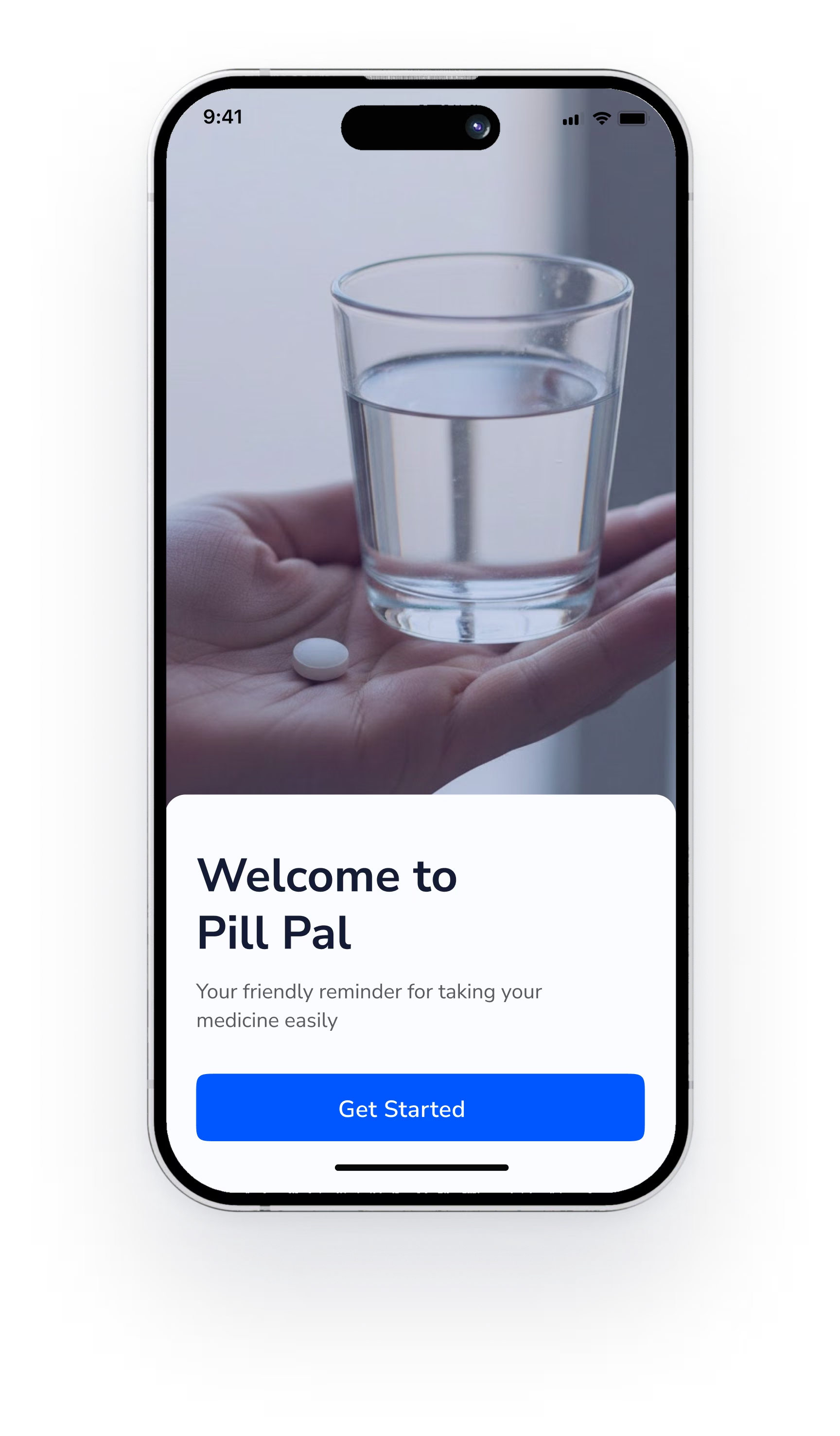
A Gentle Start toYour Daily Care.
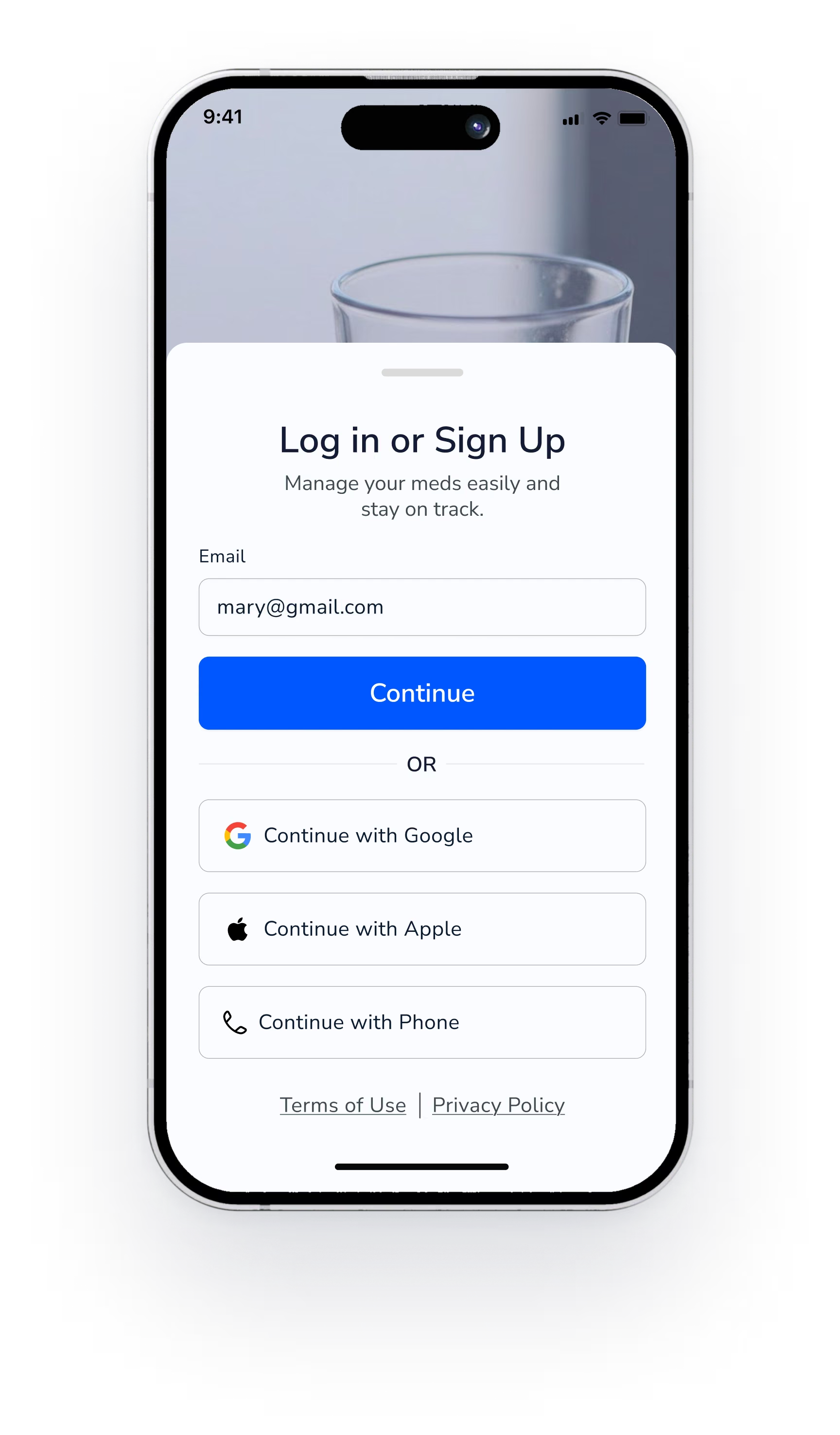
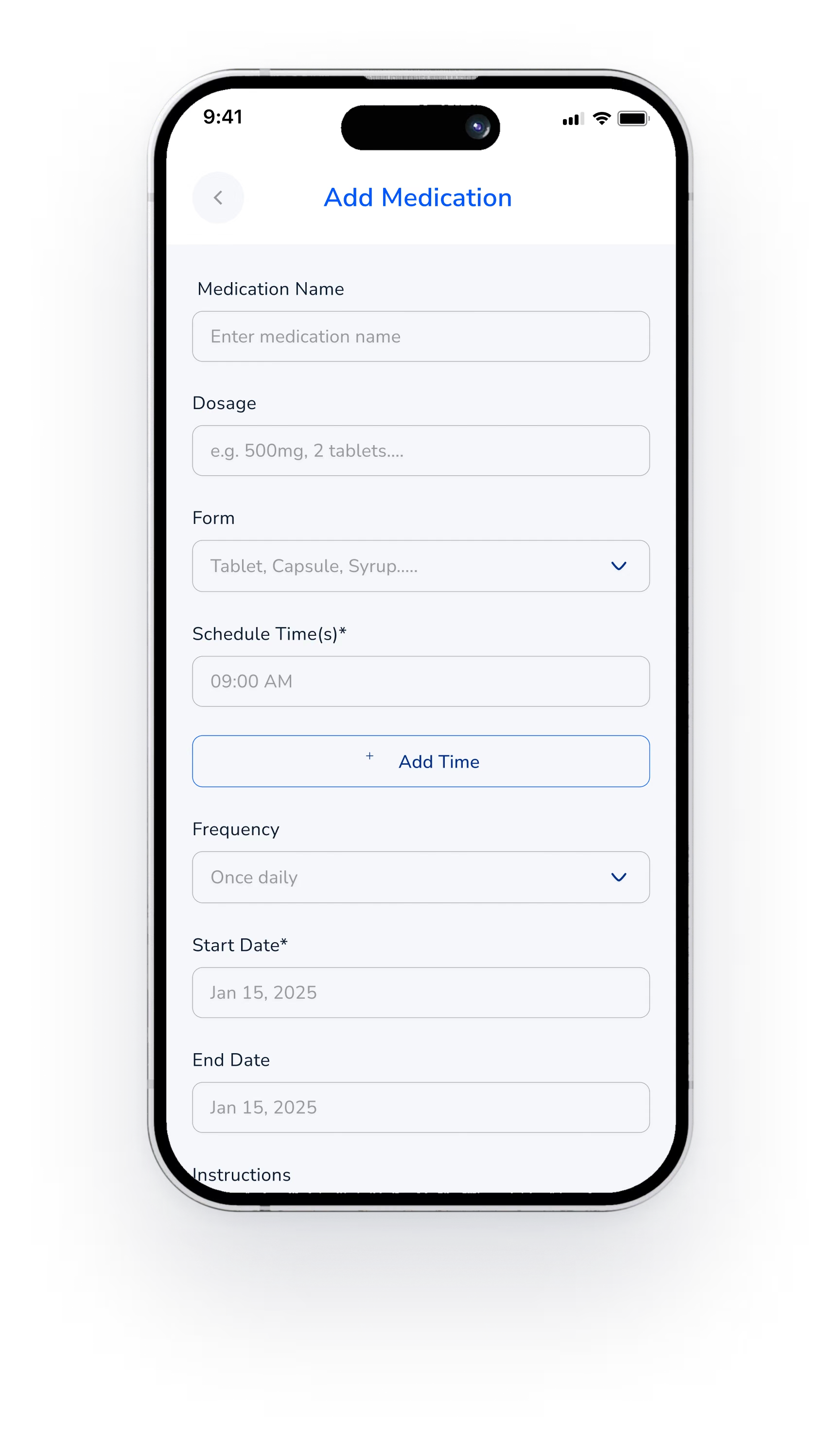
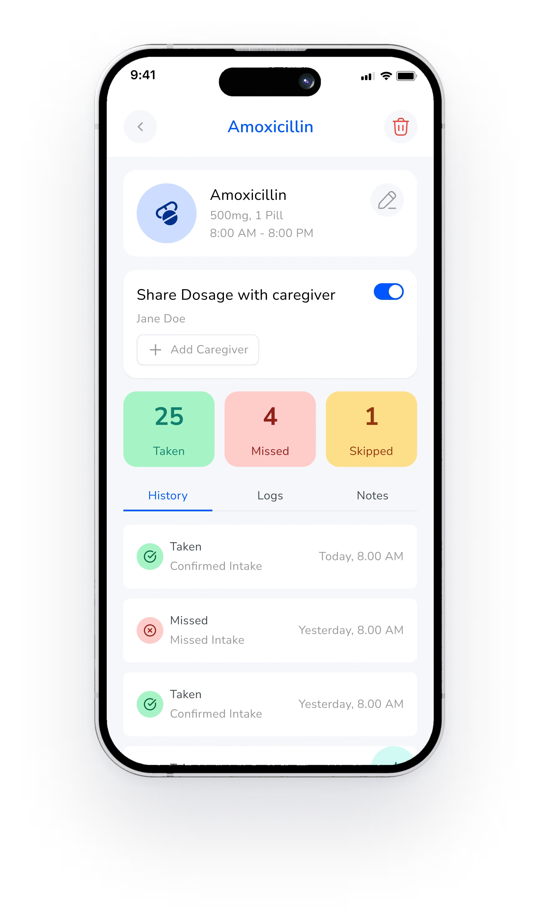
From the first screen to the daily view, every step asks for one clear action.
Get started
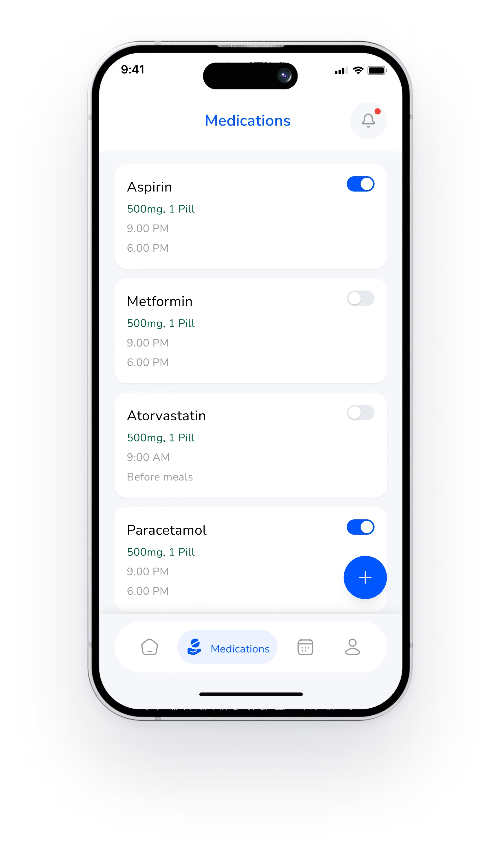
Every dose in view
Help IsOne Question Away.
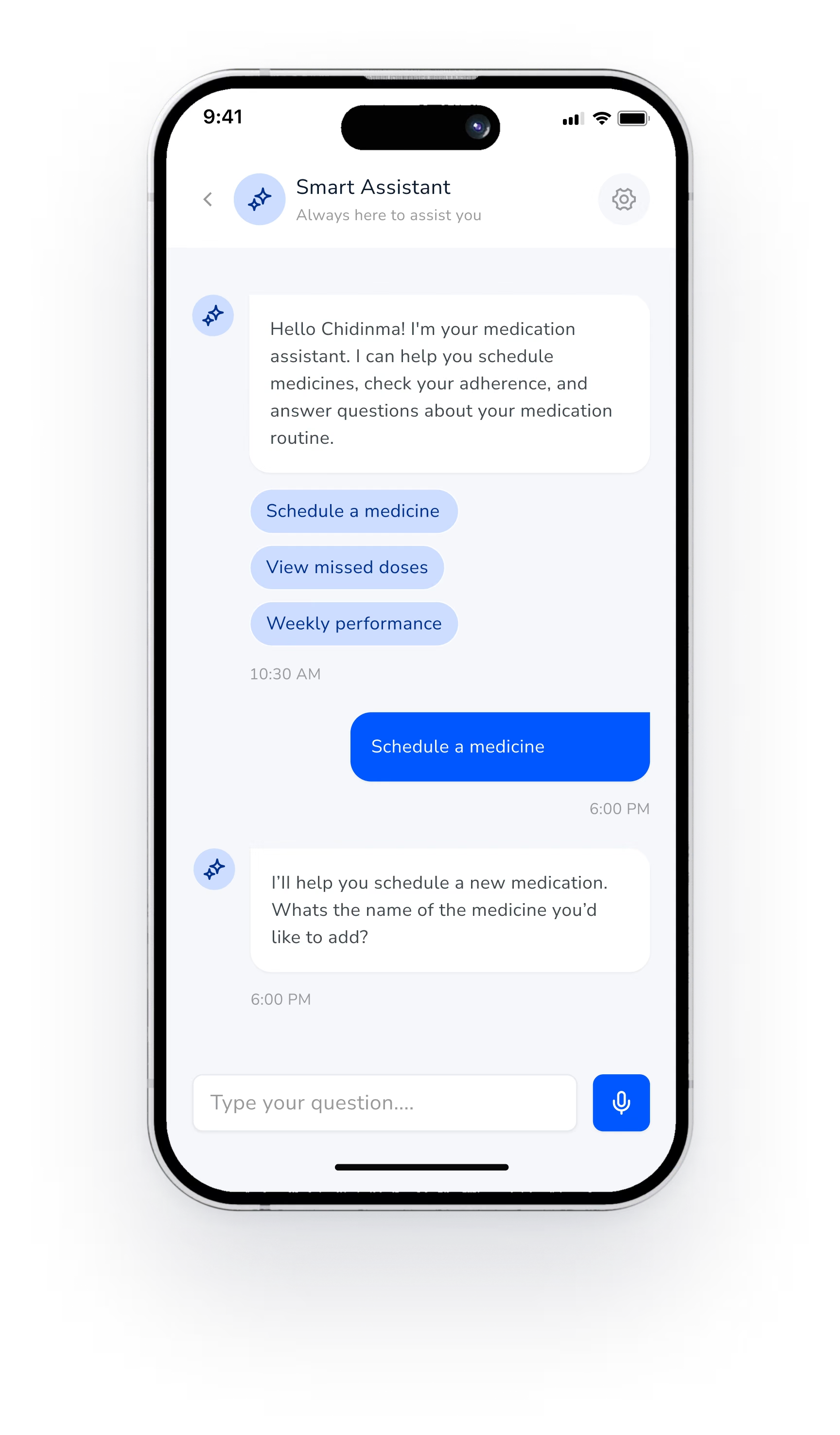
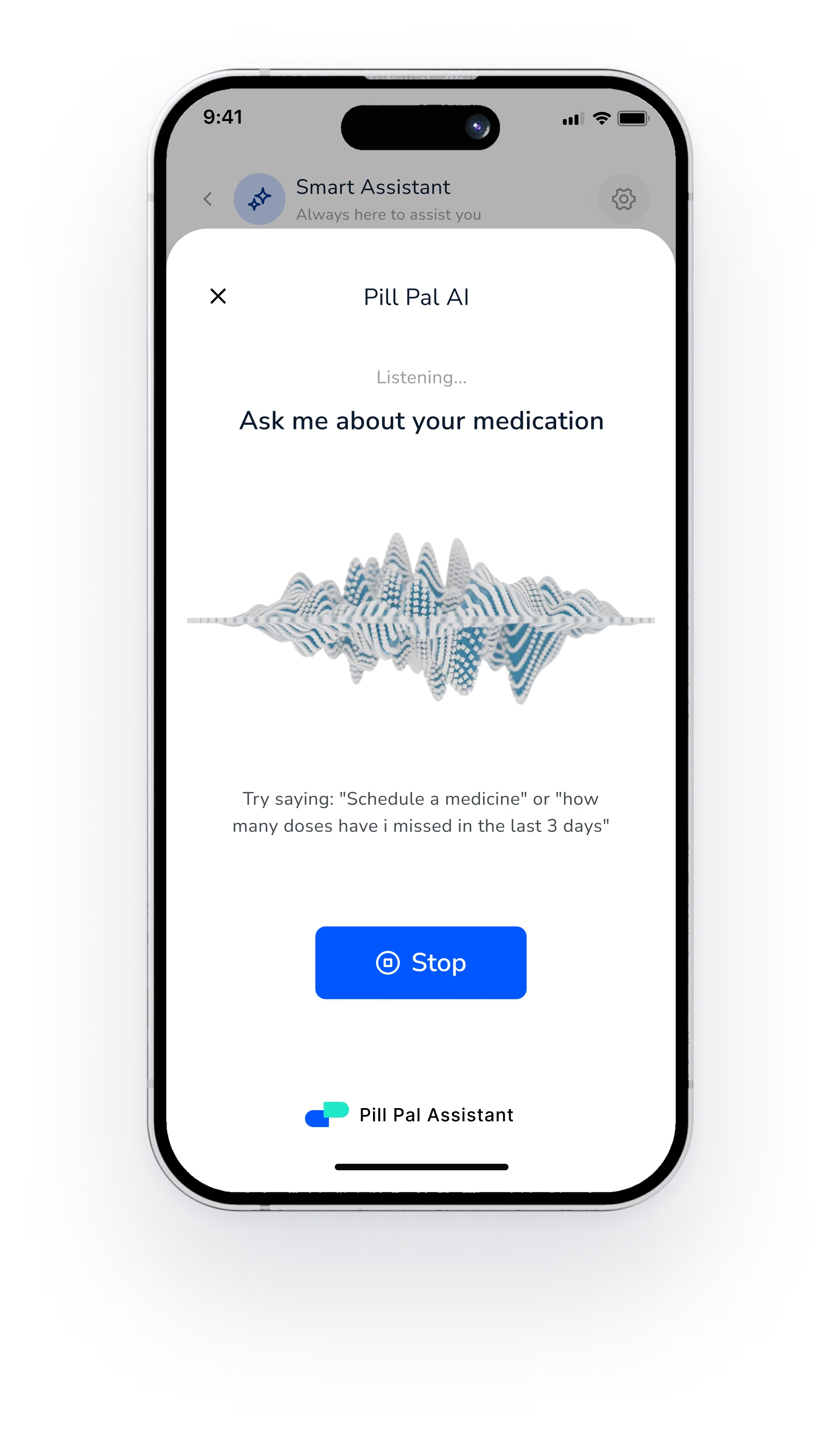
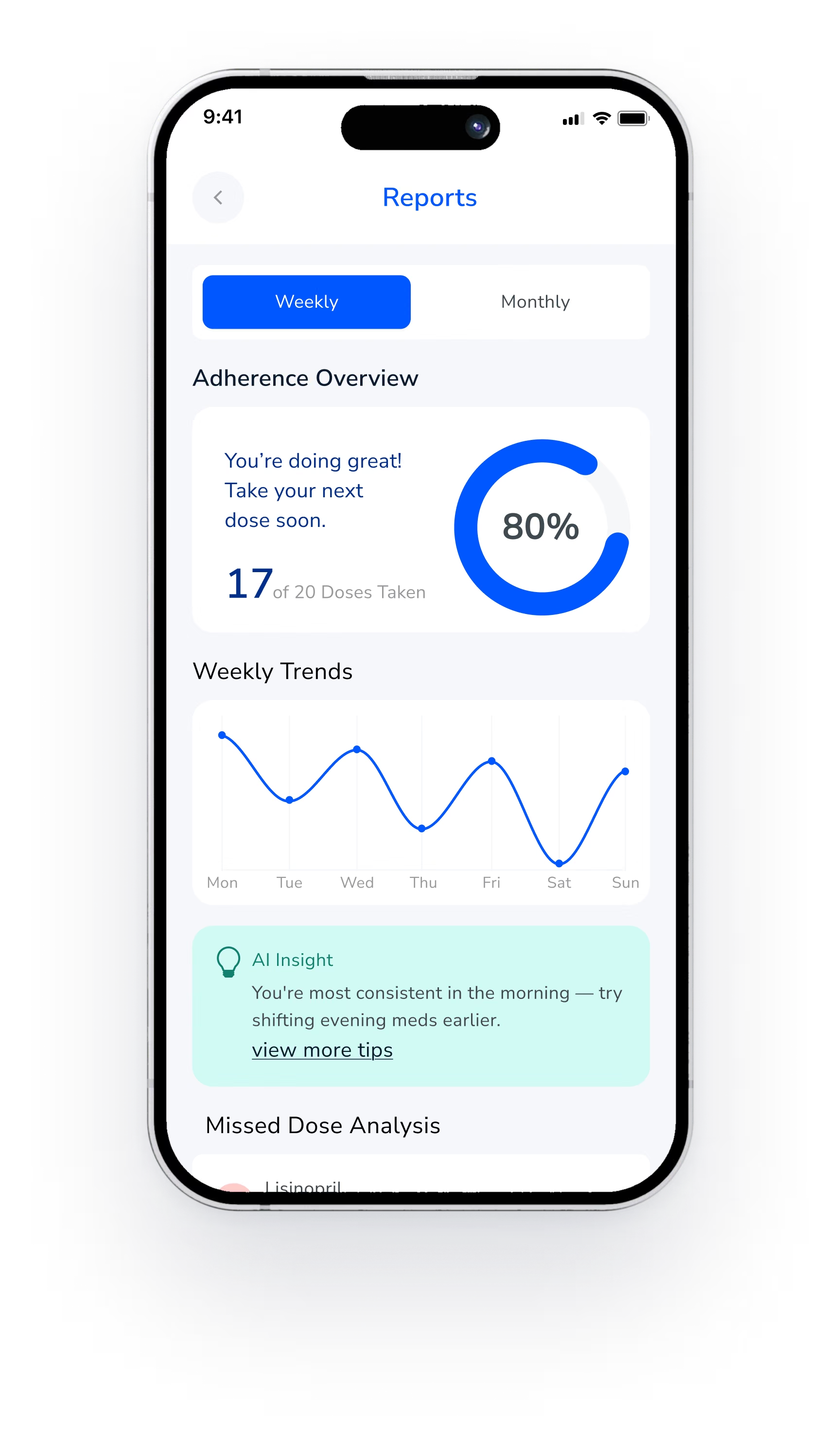
Ask by text or voice, follow your week, and let the people who care for you know when a dose is missed.
Testing for aCalmer Daily Routine.
We tested the core flows in 5 moderated remote sessions on a Figma prototype, October 2025.
Add a medicine
4 of 5
completed without help
Confirm a dose
5 of 5
completed without help
Change text size
3 of 5
completed without help
“I like that it waits for me. I tap Taken and I know it is done.”
Tester, 68 · Takes three daily medicines
Key takeaways
01
Accessibility is the product
Clear type, strong contrast and voice support are not extras in health apps. They decide whether the app works at all.
02
Simple is powerful
Fewer steps, larger controls and plain language lower the load for older users, and help everyone else too.
03
Progress motivates
Simple daily and weekly summaries turned a routine task into something people could see and celebrate.